
Tuesday, December 14, 2010
Out of Proportion
Fine Arts Festival Poster


Thursday, December 2, 2010
David Hockney

Portrait Photography


Tuesday, November 23, 2010
Downtown Mall


Collage

Warm and Cool hands


Monday, November 22, 2010
Glowing Lights


Typography

Friday, October 29, 2010


Thursday, October 28, 2010

Mid-term Exam


Camera RAW


Wednesday, October 20, 2010
Spooky Face

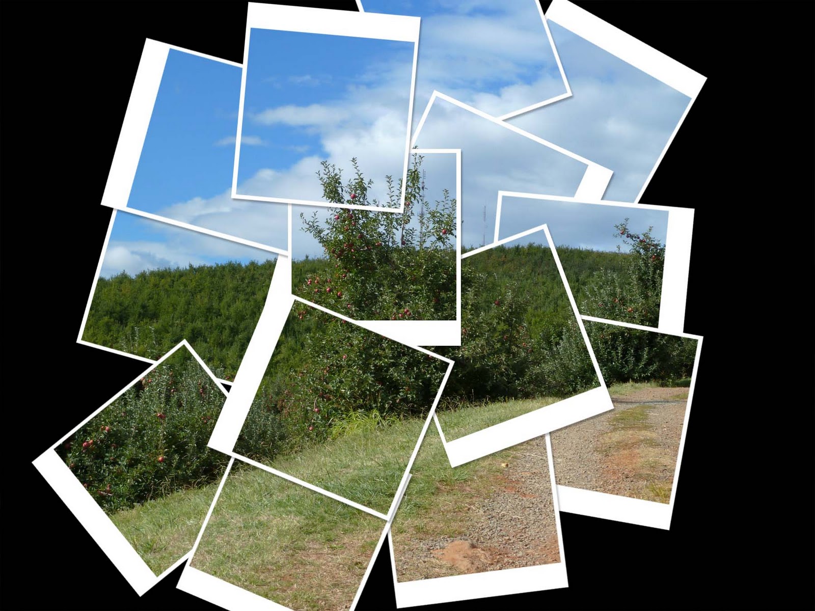
Carter Mountain


Tuesday, October 19, 2010


Monday, October 4, 2010


Subscribe to:
Comments (Atom)