digital imaging
Tuesday, January 4, 2011
Tuesday, December 14, 2010
Fine Arts Festival Poster
This poster is used for the Fine Arts Festival, a festival where every school contributes artwork into it. I designed it by using some ideas of previous posters, but mostly my own new ideas.
Thursday, December 2, 2010
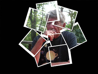
David Hockney
David Hockney is a Painter/Photographer. He is known for taking multiple pictures and blending them into one single image. His style is shown above, he takes a group of pictures, and then places them in a pattern which makes it look like one picture.
Portrait Photography
I made an Ink Sketch, Cross processed, and Made a new custom shape in these pictures. For the Ink sketch, i made it into a drawing that looks like its been painted in ink after outlining everything. For the cross-processing i made it look like i dipped a picture in chemicals it shouldn't have been dipped in. And finally, for the custom shape, i created a custom shape using pen paths and color dumping.
Subscribe to:
Comments (Atom)


